Monster Taco
Overview
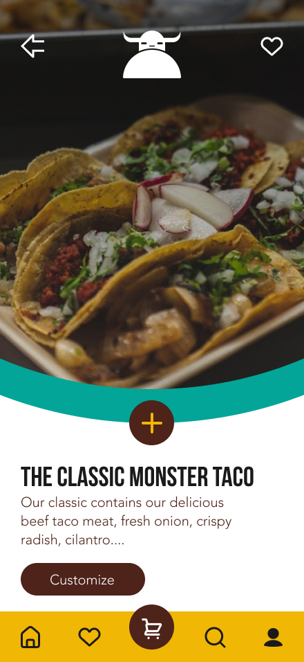
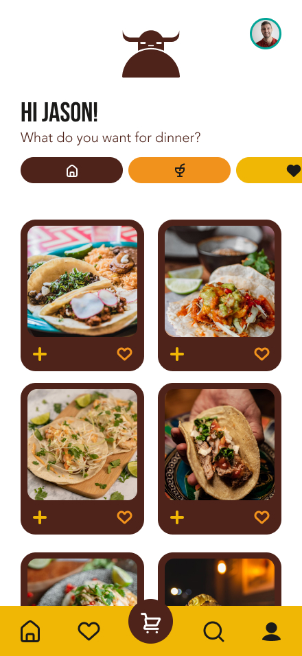
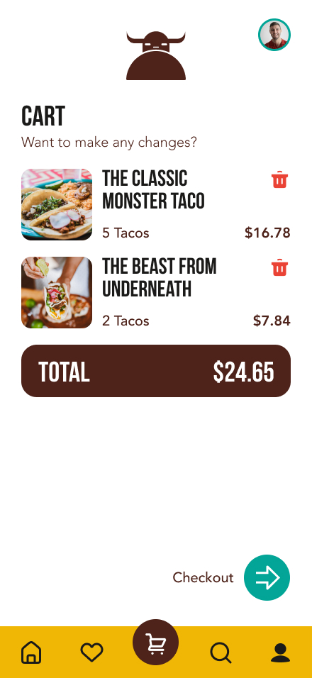
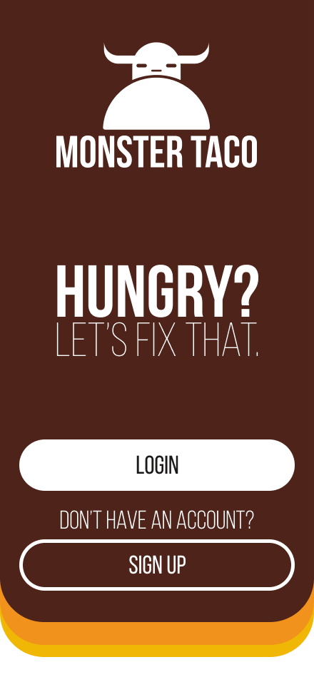
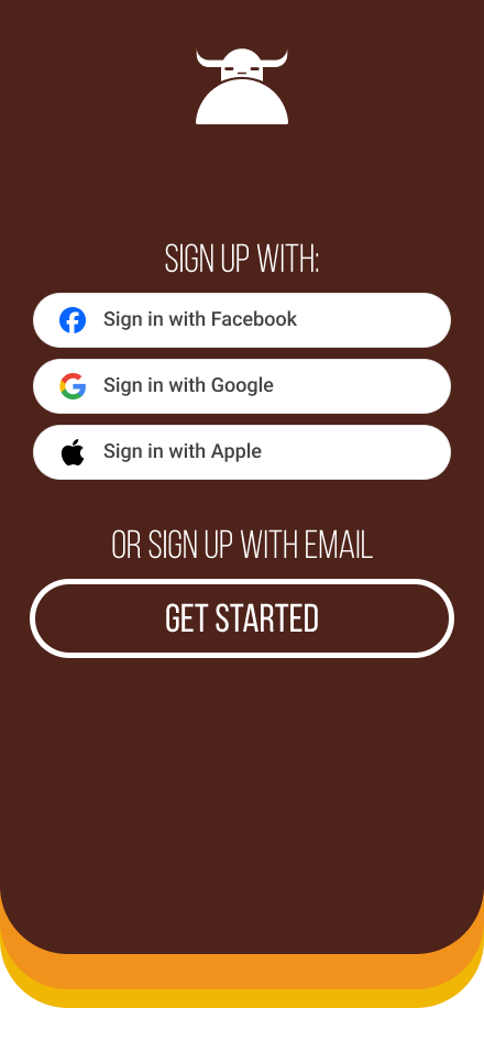
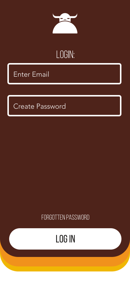
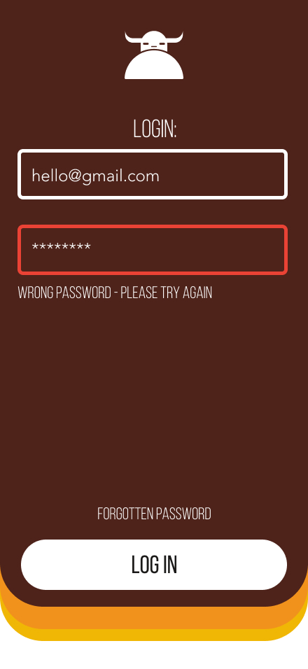
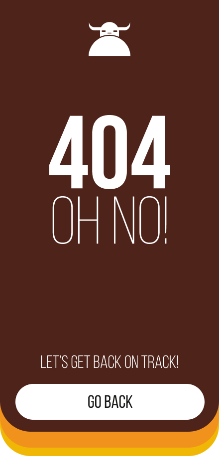
Monster Taco is a lively restaurant app created for young adults in Vancouver, BC, aged 18–35. With bold colours like brown, orange, yellow, and teal, the app offers a fun and easy way to order tacos. I worked on the UI design, focusing on making the navigation smooth, the visuals engaging, and the features like order customization, delivery tracking, and quick checkout simple to use. This project highlights modern design and practical functionality, tailored perfectly for the target audience.

The UI:
The Research!
To design an app that resonates with Monster Taco’s young audience, I researched user preferences, behaviours, and pain points when ordering food online. This research included personas, and usability testing.
Persona's
Name: Mia Chen
Age: 24
Occupation: Social Media Manager
Bio:
Mia lives in downtown Vancouver and loves exploring new food spots with her friends. She’s active on Instagram and enjoys posting trendy meals, especially from unique local restaurants. She prefers apps that are visually engaging and easy to use, allowing her to quickly share her experience online.
Goals:
- Find unique and customizable menu items.
- Easily share her order or photos on social media.
- Look for promotions or loyalty rewards.
Frustrations:
- Complicated checkout processes.
- Apps that lack visually appealing design.
Name: Priya Singh
Age: 31
Occupation: HR Specialist
Bio:
Priya enjoys hosting casual get-togethers with her friends and is often the one responsible for ordering group meals. She loves Monster Taco’s fun vibe and menu, which appeals to everyone in her friend group. She needs an app that makes it easy to order multiple items and split payments.
Goals:
- Order multiple tacos and customize for different preferences.
- Split payment options for group orders.
- Access group deals or discounts.
Frustrations:
- Apps that don’t allow easy customizations for group orders.
- Unclear pricing breakdowns.
Name: Diego Martinez
Age: 20
Occupation: University Student
Bio:
Diego is a second-year university student at UBC. He loves tacos but is always on a budget. Diego appreciates when restaurants offer combo deals and rewards programs. He primarily orders takeout while studying or hanging out with friends.
Goals:
- Find affordable meal options.
- Access student discounts or loyalty programs.
- Place orders quickly between study sessions.
Frustrations:
- High delivery fees.
- Difficulty finding combo deals in the app.
Name: Lucas Brown
Age: 27
Occupation: Freelance Graphic Designer
Bio:
Lucas works late hours and often orders food to keep his energy up during projects. Based in East Vancouver, he values convenience and fast delivery options. He wants to find food that satisfies his hunger without spending too much time navigating an app.
Goals:
- Quickly reorder favorites like “The Classic” taco.
- Access a clear and intuitive checkout process.
- Get updates on delivery times.
Frustrations:
- Apps that don’t save favorite orders.
- Lack of clear delivery tracking information.
Usability Testing
Testing Details:
- Date: February 2024
- Participants: 8 users, ages 18–35, based in Vancouver, BC.
- Method: Task-based testing and observation, followed by post-task surveys.
- Goal: Assess the app’s usability in ordering “The Classic” taco and completing checkout.
Tasks Tested:
- Locate “The Classic” taco in the menu.
- Customize the order (e.g., toppings, quantity).
- Add the item to the cart.
- Review the cart and proceed to checkout.
- Complete the checkout process.
Findings:
What Worked Well
Menu Navigation:
- 6/8 users found the menu easy to navigate with intuitive categories and a prominent search bar.
- Bright, contrasting colors (brown, orange, yellow, and teal) made important UI elements stand out.
Customizations:
- 7/8 users appreciated the clear and accessible customization options for “The Classic.”
- Visual feedback, like checkmarks and previews of customizations, helped users feel confident in their choices.
Checkout Process:
- 5/8 users found the checkout process straightforward, with clear buttons like “Proceed to Checkout” and “Place Order.”
- Integration of Apple Pay/Google Pay was seen as a plus for quick payment.
Pain Points Identified
Discoverability of Favorites:
- 4/8 users struggled to locate a way to save “The Classic” as a favorite for future orders.
- Users suggested adding a “Heart” or “Save for Later” feature to the menu items.
Delivery Fee Transparency:
- 3/8 users found it unclear how the delivery fees were calculated until the final stage of checkout.
- They requested earlier visibility of fees in the cart summary.
Group Ordering:
- 2/8 users noted the lack of a “Split Bill” feature for group orders.
- Participants suggested adding this functionality to appeal to the target demographic’s social habits.
Quantitative Metrics:
- Task Completion Rate: 87.5% (7/8 users completed all tasks successfully).
- Average Time to Place Order: 3 minutes 45 seconds.
Conclusion:
Overall, the Monster Taco app demonstrates strong usability for its primary functions but could enhance user satisfaction by addressing specific pain points like saving favourites and improving fee transparency.
